
Inspire Donors and Advocates with Interactive Stories
Turn complex data into visuals that engage supporters, secure funding, and drive action for your nonprofit’s mission.


4.7 out of 5 stars


Overview
Why
Types
Examples
Reviews
Tips
FAQ
Stand Out with Impactful Visuals
As a nonprofit professional, you juggle donor relations, campaign planning, and impact reporting while striving to make your cause resonate. Infogram helps you transform raw data into clear, interactive visuals that tell your story - whether it’s showing donors the impact of their contributions or rallying support for a policy change.
Our straightforward tool lets you create charts, maps, and infographics that connect with your audience, from board members to community advocates.
You can import data from spreadsheets or databases and use our AI to suggest the best visuals, saving you hours of prep time. Share these visuals on your website, in grant proposals, or across social media with no coding required. Every visual is responsive and updates automatically, ensuring your message stays current and accessible.
Explore Infogram to see how it simplifies your work, letting you focus on building support and advancing your mission.
5 Reasons Why Nonprofits Choose Infogram
Learn more about practical ways Infogram helps you communicate impact and inspire action.

Engage Donors and Supporters
Create interactive visuals that draw in donors, volunteers, and community members. For example, show donors the human impact of their gifts with a clickable map of lives changed or an animated chart of fundraising progress. With over 35 chart types and 800+ maps, Infogram helps you craft stories that stick. These visuals boost engagement on platforms like X, encouraging supporters to share your cause and stay connected.
Show Impact with Clear Data
Turn complex data into clear visuals to showcase your nonprofit’s impact in grant reports, advocacy briefs, or donor updates. Create a timeline of project milestones for funders or a map of program outcomes for board presentations. AI suggests the best charts, and data imports from PDFs or spreadsheets save time. This clarity helps grant writers, program directors, and researchers build trust with stakeholders.
Amplify Social Media Reach
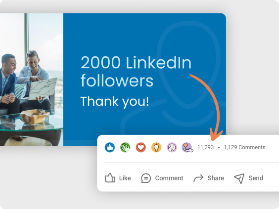
Visuals drive shares on social media, and Infogram makes it easy to create graphics for platforms like Instagram or LinkedIn. Share an infographic on X about your advocacy campaign or a chart showing donation growth to attract followers. Customizable templates with your nonprofit’s logo and colors ensure brand consistency. Content engagement analytics show what resonates, helping you refine your outreach.
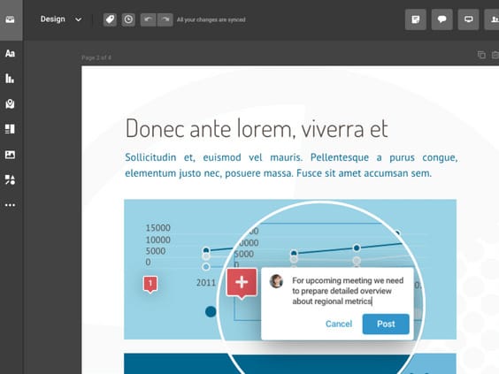
Collaborate as a Team
Infogram’s real-time collaboration keeps your team aligned, even across departments or remote volunteers. Fundraising and program teams can co-create visuals for donor pitches, while campaign managers work with analysts on advocacy reports. Team templates ensure consistency, and commenting streamlines feedback. This saves time and keeps your visuals mission-focused.
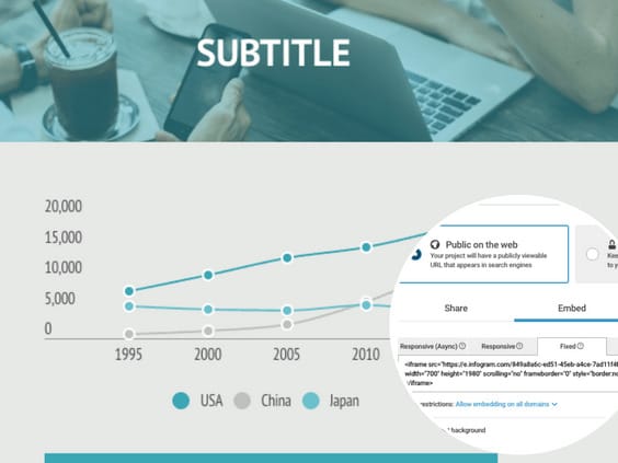
Share Anywhere, Effortlessly
Embed visuals in websites, grant proposals, or board presentations with no coding needed. Auto-updating charts keep donor newsletters or live dashboards current, saving you manual updates. For example, include an interactive map in a policy briefing or a live data slide for your board. Responsive designs look great on any device, ensuring broad reach.

Build Trust with Professional Visuals
Create polished, branded visuals for fundraising or advocacy without design skills. Use your logo and colors with our brand kit to craft grant proposals or donor reports that look professional. Royalty-free assets and features like color gradients add polish, while custom tooltips clarify data for non-experts. This helps fundraising managers and grant writers make a strong case to stakeholders.
Explore Most Loved Features

Image Background Removal
Remove unnecessary backgrounds from images with a simple click. Cut out objects, create photomontages, and more.

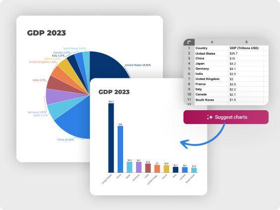
Chart Library
Choose from a diverse range of chart types in Infogram's extensive library. Customize colors and labels to present your data in a visually compelling way, making complex information easily understandable.

Map Library
Visualize geographic data effectively with Infogram's map library. Select from various map styles and formats to enhance the impact of your storytelling and showcase regional insights.

Data Import
Effortlessly import data from various sources into Infogram, ensuring accurate and up-to-date visualizations for your reports. Streamline your data management process and focus on analyzing insights.

Annotations and Callouts
Add explanatory text, highlights, and insights to your data visualizations with Infogram's annotation and callout features. Provide context and enhance audience understanding of your nonprofit's impact.

Real-Time Collaboration
Collaborate seamlessly with your team members, editors, and contributors in real-time. Share projects, leave comments, and track changes, facilitating efficient teamwork and content creation.

Auto-Aligning Content
Simplify the layout of your projects with Infogram's auto-align feature. With just a click, you can easily change the alignment of objects on your canvas, enabling you to create image galleries or dashboards with ease.

Project Embeds
Enhance your website or blog with interactive visualizations by seamlessly integrating them through Infogram's project embeds. Create an engaging and immersive experience for your audience.

Brand Kit
Ensure consistent branding across all your projects with Infogram's brand kit. Effortlessly upload and apply your nonprofit's logos, color schemes, and fonts to maintain a cohesive visual identity.

Content Engagement Analytics
Gain valuable insights into audience behavior and engagement with Infogram's comprehensive analytics. Refine your content strategy based on real-time feedback, ensuring maximum impact and resonance.
Get Inspired by Infogram User Created Projects

This Is Our Solar System
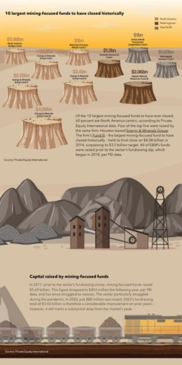
10 Largest Mining-Focused Funds to Have Closed Historically

Health to the plants

Automation & jobs

FiveThirtyEight: Looking to November

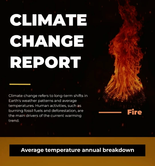
The Not Enough Impact Report 2018

The Impact of the Better Care Reconciliation Act on Employment

10 Wins You Made Happen
Customer Reviews
Here is what our customers have to say about us.
2022 Summer & Fall and 2023 Winter leader in Data Visualisation Software 4.7 out of 5 stars
See reviews on G2 ›Empowering 30,000+ Companies Worldwide
From startups to established enterprises, our platform has been embraced by a diverse range of businesses seeking to captivate audiences and simplify complex data. Here are just a few examples of the 30,000+ companies that use Infogram.


Learn More Practical Tips
Finance
A Practical Guide to Creating Financial Reports
Marketing
Progress report: What it is and how to write a progress report
Design
Data visualization trends you should look out for in 2023
Marketing
5 tips on writing online articles that people actually want to read
Organizations
The ultimate nonprofit marketing guide: Strategies and tools for success
Organizations
Prove nonprofit impact with an outstanding SROI report
Frequently Asked Questions
How can Infogram help me create visuals for grant proposals?
Infogram’s library of over 35 chart types and 800 maps lets you turn program data into clear visuals for grant applications. For example, create a bar chart showing people served or a map of project locations to strengthen your case. AI suggests the best layouts, and features like custom tooltips clarify metrics for funders. Import data from spreadsheets or PDFs to save time, ensuring your proposal looks professional and compelling.
How does Infogram support donor engagement through visuals?
Interactive visuals, like clickable maps or animated fundraising trackers, show donors the direct impact of their contributions. Embed these in newsletters or on your website to keep supporters engaged. Content engagement analytics track clicks and shares, helping you understand what motivates donors. This data-driven approach builds trust and encourages repeat giving.
Can Infogram help with advocacy or public awareness campaigns?
Yes, create infographics or interactive charts to highlight issues like poverty rates or policy impacts for campaigns. For example, an advocacy specialist can map community needs to rally support on X. Customizable templates with your branding and royalty-free assets ensure visuals are shareable and professional. Animations like zooms or fades draw attention to key points, boosting campaign reach.
How does collaboration work for nonprofit teams in Infogram?
Infogram’s real-time collaboration lets fundraising, program, and advocacy teams work together seamlessly, even remotely. Share team templates to maintain consistent branding for donor reports or campaign visuals. Commenting features streamline feedback, so grant writers and program coordinators can align on visuals for proposals. This keeps distributed teams or volunteers efficient and mission-focused.
How can Infogram save time for nonprofits on tight budgets?
Our AI-powered tools, like chart suggestions and image-to-data conversion, cut down on design time, letting you focus on your mission. Free tutorials and a dedicated support team help you navigate challenges without costly training. Features like content auto-align and royalty-free assets make professional visuals accessible, even with limited resources. Start with our free plan to test the platform’s value.
What insights can I gain from Infogram’s engagement analytics?
Analytics track how donors, supporters, or policymakers interact with your visuals, like clicks on a fundraising chart or shares of an advocacy infographic. For example, see which parts of a donor report get the most attention to refine your messaging. These insights help campaign managers optimize outreach and grant writers demonstrate impact, driving better engagement and funding outcomes.
Didn't find the answer? Check our FAQs

Try Infogram Now!
Are you ready to unleash the power of data visualization? Get started with Infogram today and create stunning, interactive content that captivates your audience. Elevate your projects and bring data to life.