
Visualize Data with Interactive Radar Charts
Create dynamic radar charts to compare data at a glance. Perfect for analysis and storytelling across fields.


4.7 out of 5 stars


Overview
Why
Reviews
Tips
FAQ
Effortless Data Visualization with Interactive Radar Charts
Creating impactful, data-driven content can be challenging. Whether you’re building reports, dashboards, or infographics, it's easy to get slowed down by the complexity of organizing and presenting data in a way that’s clear, engaging, and easy to understand. That’s where radar (or spider) charts come in. These unique charts visually capture multiple variables on a single, eye-catching diagram, making them ideal for showcasing complex data patterns or comparing several items simultaneously.
Radar charts are particularly effective for highlighting strengths and weaknesses across categories, enabling users to tell a more complete story with their data.
Content writers, journalists, analysts, marketers, and consultants find radar charts invaluable when comparing data points at a glance or illustrating trends in areas like performance, skills, or survey results. By using radar charts, you can present data in an intuitive, visually compelling way, helping your audience grasp insights faster.
Infogram’s radar charts stand out because they’re easy to customize and interactive, designed to help you create polished, professional visuals with minimal effort. Unlike other tools, Infogram lets you seamlessly integrate radar charts into reports and infographics with rich, dynamic details that engage your audience. Ready to make your data shine? Dive deeper into the benefits of radar charts on Infogram and start creating visuals that make an impact today.
Explore Why Radar Charts Are Useful
Learn how radar charts make data comparison easy, highlighting key insights for impactful storytelling across any field.
Simplify Complex Data
Interactive radar (also known as spider) charts simplify the comparison of multiple variables across categories, making it easier to present complex datasets in an accessible format. When working with multi-dimensional data, such as comparing product performance across different features, this chart type provides a single view that lets you see strengths, weaknesses, and overall patterns quickly.
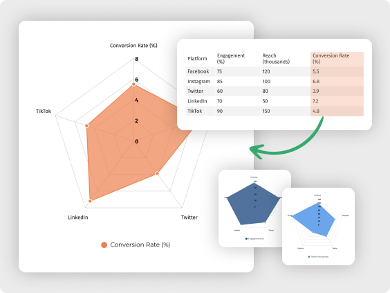
For instance, a marketer assessing social media performance can use radar charts to compare engagement, reach, and conversion rates across platforms, allowing them to pinpoint which channels need improvement. Similarly, journalists can use these charts to visually compare survey responses or poll results, presenting their audience with a clear breakdown of opinions. By gathering all relevant data on one visual plane, radar charts eliminate the need for complex tables or lists, making information more digestible and visually engaging.
Boost Audience Engagement
Unlike static charts, interactive radar charts allow viewers to engage with the data actively, making the information more memorable and easier to interpret. In fields like consulting and data analysis, where insights are often shared with clients or stakeholders, adding interactivity means users can explore individual data points, hover over segments for details, and focus on specific areas of interest.
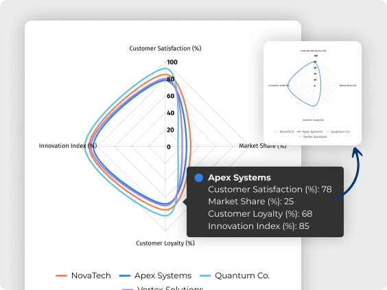
For example, a consultant presenting an analysis of market trends could use interactive radar charts to allow clients to isolate certain factors, such as customer satisfaction or market share, encouraging a hands-on approach to understanding the data. This level of engagement is particularly valuable for content creators and analysts who want to make their data stand out, as it helps audiences better retain and understand key points.
Clear Visual Comparisons
Interactive radar charts are uniquely effective for supporting decision-making because they offer a visual, side-by-side comparison of multiple variables, helping users identify trends and insights that might not be immediately apparent from raw data alone.
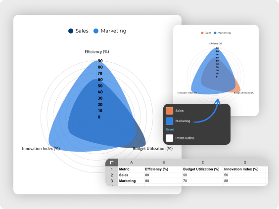
For instance, a data analyst assessing employee performance across skill sets can use radar charts to spot where specific departments or individuals excel or require training, directly supporting actionable decisions. Marketers can also benefit by comparing campaign metrics across different demographics, and identifying which audiences are responding most favorably to their strategies. These clear visual comparisons allow users to make informed decisions based on data-backed insights, speeding up the process of finding solutions and enabling more targeted, data-driven actions.
Adapting Across Diverse Use Cases
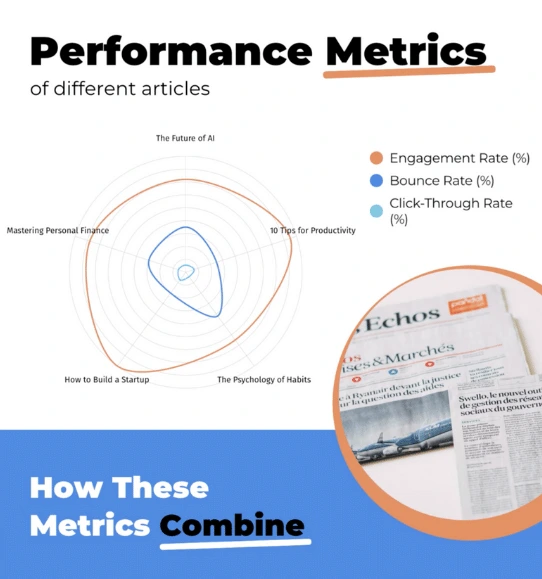
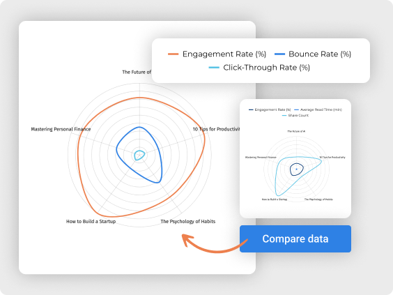
One of the standout qualities of radar charts is their adaptability across various fields and types of data, making them a valuable tool for professionals from different industries. Content writers, for example, can use radar charts to compare article performance metrics like engagement rate, read time, and share count, instantly seeing which topics resonate most with readers.
Meanwhile, a journalist might rely on radar charts to show how different political candidates align across key issues, providing a clear visual summary for readers. This flexibility makes radar charts a go-to tool for quickly displaying comparative data, regardless of the industry or use case. For users who need a versatile chart that adapts to different datasets and reporting requirements, radar charts offer a customizable, engaging solution that helps make projects visually appealing and information-rich.
Customer Reviews
Here is what our customers have to say about us.
2022 Summer & Fall and 2023 Winter leader in Data Visualisation Software 4.7 out of 5 stars
See reviews on G2 ›Empowering 30,000+ Companies Worldwide
From startups to established enterprises, our platform has been embraced by a diverse range of businesses seeking to captivate audiences and simplify complex data. Here are just a few examples of the 30,000+ companies that use Infogram.


Learn More Practical Tips
Design
Different types of data visualizations and when to use them
Design
The complete guide to different types of charts
Media
From data to story: Data journalism definition & examples
Media
How to choose the right chart for your data
Design
Try Out Our Latest Chart Types
Design
Introducing 4 new chart types in Infogram
Frequently Asked Questions
What is a radar (spider) chart, and how does it work?
A radar chart, also known as a spider chart, is a circular graph used to compare multiple variables. It displays data along various axes radiating from a central point, like spokes on a wheel. Each axis represents a different data category, and values are plotted on each axis to create a web-like shape. This visual format makes it easy to see strengths, weaknesses, and overall patterns within a dataset at a glance.
Where are radar (spider) charts commonly used?
Radar charts are popular in fields where comparing multiple categories or performance metrics is essential. In business, they’re often used to compare product features, customer satisfaction metrics, or employee skills. In data analysis, they help visualize survey results or compare trends across different groups. They’re also useful in academic settings for tracking progress across multiple skills, such as language abilities or research competencies.
What are some best practices for creating effective radar charts?
To maximize the clarity and effectiveness of radar charts, keep these tips in mind:
- Limit the number of variables: Too many can make the chart crowded and hard to read.
- Choose consistent scales: Use the same scale for each variable to avoid confusing the audience.
- Label clearly: Make sure each axis has a clear, descriptive label.
- Highlight key points: Emphasize important areas with color or annotations to guide your audience’s focus.
These practices ensure your radar chart communicates insights quickly and clearly.
How can radar charts be helpful in a professional setting?
Radar charts are valuable tools in the workplace because they simplify complex comparisons. For example, a marketing team might use them to compare campaign results across different social media channels, instantly seeing which platforms perform best. Consultants can use radar charts to show clients a side-by-side view of their strengths and improvement areas. This clear, comparative view supports more informed decisions and better strategic planning.
Why are radar charts useful for academic purposes?
In academic settings, radar charts are excellent for tracking and visualizing progress in multiple areas. For example, teachers can use radar charts to monitor a student’s growth across different subjects, providing a comprehensive view of their strengths and improvement areas. Researchers may also use them to compare various study results or outcomes, helping them see relationships and patterns across data categories quickly.
How do I create a radar (spider) chart in Infogram?
Creating a radar chart in Infogram is easy and straightforward.
- Simply select “Radar chart” from the chart options, then input or upload your data into the chart editor.
- Infogram’s intuitive design tools let you adjust labels, colors, and other settings so you can customize the chart to suit your needs.
- Once completed, you can make the chart interactive, publish it, or share it with others directly.
Can I customize my radar chart in Infogram?
Absolutely! Infogram lets you customize your radar chart to fit your project’s style and focus. You can adjust colors, change the font size and style, label each axis clearly, and even add interactivity to make the chart more engaging. Infogram’s customization tools make it easy to create a polished, professional look that aligns with your brand or presentation needs.
What types of insights can radar charts uncover?
Radar charts reveal patterns, strengths, and gaps across multiple dimensions, which helps users draw meaningful insights. For instance, a business might see how a product’s features compare to competitors, or a team could identify which skills they excel in versus those they need to develop. By showing each variable on the same chart, radar charts help users visualize relationships and see how categories compare at a glance.
What makes Infogram’s radar charts different from those in other tools?
Infogram’s radar charts stand out for their interactivity and ease of use. Unlike many tools, Infogram allows you to make charts interactive, helping viewers explore each data point in detail. Plus, with customizable features like labels, colors, and annotations, you can tailor each chart to fit your audience and goals. Infogram’s user-friendly interface makes it easy to create professional, eye-catching radar charts in just a few steps.
What kind of integration does Infogram provide to create live-updating charts and maps?
With Infogram, you can create dynamic charts and maps that update live and in real time. We support two integrations for live updates - Google Sheets and JSON feeds.
As soon as the data changes in the Google Sheet or JSON file, the chart or map it is linked to will automatically update, even when embedded.
Note: Infogram doesn't support formulas, only raw data. If you use formulas or other scripts in your Google sheet, the calculations may not show on Infogram after the import.
How do I create a live-updating chart or map via a JSON feed?
- Add a chart or map to your project canvas by clicking the Add chart or Add map buttons in the left side panel.
- Double-click the chart to open its editor. Above the data table, you will see data import buttons. Choose the Add JSON feed option.
- Now, when you edit the information in your JSON feed, it will automatically update in your Infogram chart. The chart refreshes data every 30 seconds to a minute. These changes will automatically apply to your embeds and shared URL link.
Didn't find the answer? Check our FAQs
Try Infogram Now!
Are you ready to unleash the power of data visualization? Get started with Infogram today and create stunning, interactive content that captivates your audience. Elevate your projects and bring data to life.
Try it now