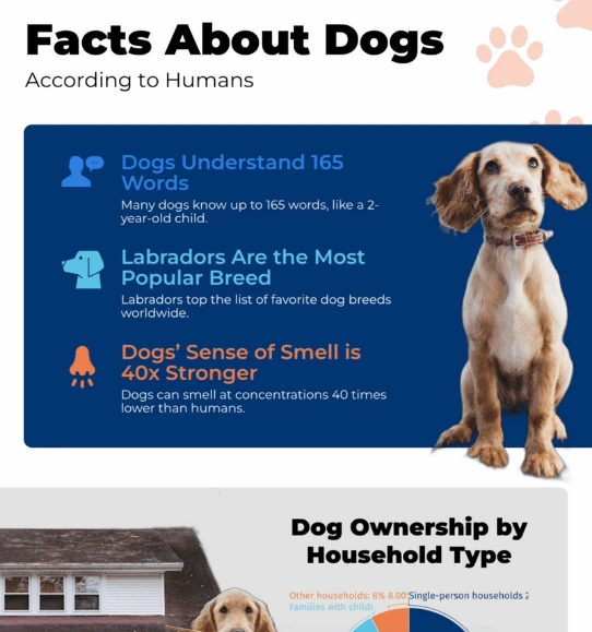
Create Interactive Facts and Figures

Improve your storytelling with dynamic facts and figures charts.


4.7 out of 5 stars


Overview
Why
Examples
Reviews
Tips
FAQ
Showcase Data Points in Dynamic Format
Creating impactful reports, dashboards, or infographics often involves navigating the challenges of presenting accurate, meaningful data in a way that captures your audience’s attention. Many of us struggle with how to include essential facts and figures without overwhelming viewers or losing their message in complex spreadsheets and static charts. Infogram’s interactive facts and figures addresses these challenges by enabling you to showcase critical data points in dynamic, engaging formats.
Facts and figures are the foundation of clear analysis and effective decision-making. They provide solid evidence and context, helping audiences understand the story behind the numbers. By integrating these elements interactively, Infogram allows you to present data that isn’t just informative but also visually captivating and easy to navigate.
For content writers, journalists, and analysts, interactive facts and figures bring data-driven stories to life, making insights more compelling. Government employees and consultants can present crucial data transparently, while marketers and sales professionals can highlight key metrics to strengthen their messages. Teachers also benefit, as this feature helps transform raw data into understandable and memorable content.
What sets Infogram's interactive facts and figures apart is its intuitive design and seamless interactivity, making it simple to update, customize, and share. Unlike other tools, Infogram combines ease of use with powerful visual storytelling capabilities, allowing you to present data with clarity and professionalism, even if they don’t have a design background.
Ready to see the difference interactive facts and figures can make in your next project? Discover more about this powerful feature and start transforming your data presentations with Infogram.
Explore Why Facts and Figures Are Useful
Discover the benefits of using facts and figures in your data visualization projects.

Bring Credibility To Your Data
In today's information-driven world, providing trustworthy content is essential for engaging your audience. Incorporating facts and figures from reputable sources significantly enhances the credibility of your infographics. This practice demonstrates that you've conducted thorough research and that your information is grounded in reliable data.
By backing up your claims with solid statistics, you build trust with your audience, which is crucial for fostering a loyal following. When users see that you prioritize accuracy and transparency, they are more likely to engage with your content and share it within their networks.

Make Accurate and Meaningful Comparisons
Infographics often aim to compare various data sets or trends, and facts and figures play a vital role in facilitating these comparisons. Visual representations, such as line graphs, bar charts, or scatter plots, can reveal trends and relationships between variables more effectively than text alone.
By using precise data points, you can provide a clear picture of how different elements relate to each other, enabling your audience to draw meaningful conclusions. For example, showing revenue growth over time alongside marketing spend can illustrate the impact of investment on financial performance. This type of analysis empowers decision-makers to understand key drivers behind trends and to make informed choices based on evidence rather than assumptions.

Simplify Complex Information
One of the primary advantages of using facts and figures is their ability to simplify complex information. Instead of bombarding your audience with overwhelming amounts of data, you can distill the essential insights and key takeaways into visually digestible formats.
This simplification process is critical in helping your audience grasp the core messages without feeling lost in a sea of numbers. By leveraging visuals such as charts and infographics, you can present complex ideas in a straightforward manner, making them accessible to a wider audience. Additionally, clear visuals can aid retention, allowing viewers to recall and apply the information more effectively.

Communicate Your Message Effectively with Storytelling
Data storytelling is a powerful method for communicating your message clearly and engagingly. By presenting facts and figures in a logical, chronological, or sequential order, you can craft a compelling narrative that guides your audience through your infographic or project. This storytelling approach allows you to create a cohesive flow, leading viewers from one data point to the next and highlighting the significance of each piece of information.
When you structure your content as a story, you not only make it more relatable but also provide context that can deepen understanding. This technique can transform raw data into an impactful narrative that resonates with your audience, encouraging them to connect emotionally with the information presented.
Get Inspired by Infogram User-Created Projects

World Blood Donor Day

Top 100 Most Valuable Us Brands

Deep Look at National Parks in the U.S.

Healthcare Consumer Insights

The Most Popular Ice Hockey Leagues

Market Report - Portland

Buying Coffee Vs Making It

The Scope and Impact of Free-Roaming Dogs and Cats
Customer Reviews
Here is what our customers have to say about us.


2022 Summer & Fall and 2023 Winter leader in Data Visualisation Software 4.7 out of 5 stars
See reviews on G2 ›Empowering 30,000+ Companies Worldwide
From startups to established enterprises, our platform has been embraced by a diverse range of businesses seeking to captivate audiences and simplify complex data. Here are just a few examples of the 30,000+ companies that use Infogram.


Learn More Practical Tips
Marketing
Brand storytelling: 4 brand story examples to inspire you
Marketing
5 tips on writing online articles that people actually want to read
Marketing
3 Unique Ways to Optimize Your Landing Pages with Charts
Media
Essential data journalism skills for every data journalist
Design
Good and bad data visualization examples
Data
The complete guide to different types of charts
Frequently Asked Questions
How does Infogram make interactive maps easy to create?
Infogram’s 800+ maps and simple tools let you build dynamic maps quickly. A data journalist can create a clickable election map, while a market researcher can plot customer locations, all without design skills. Import data from spreadsheets or PDFs, and add features like tooltips or animations. It’s fast, intuitive, and needs no coding.
Can I use a facts and figures chart for social media?
Getting people's attention on social media can be tough. Adding beautiful facts and figures chart is a great way of getting noticed online. Infogram makes it easy to create beautiful and memorable facts and figure charts to display your important data and statistics even on social media.
How do I create a facts and figures chart?
Infogram's chart creator allows you to easily create professional facts and figures charts in just 5 steps:
- Log in to Infogram.
- Select the facts and figures chart type.
- Upload or paste your data.
- Customize the labels and adjust the design by changing the background, colors, and fonts.
- Download your facts and figures chart, add it to your project, embed it on your website, or share it on social media.
Infogram is super easy to use and made with non-designers in mind. Even if you don't have any programming, coding, or design experience, you'll be able to make facts and figures charts in just a couple of steps.
How do I add more facts to my chart?
When adding a facts and figures chart to your project, there will automatically be two facts listed. You can add and delete facts at any time. Simply click on the chart, then Edit data, and finally, click the up and down buttons to reposition facts in the right order. You can also click the red X icon to delete a fact.
Quick suggestion: Remember that simplicity is key when making facts and figures, so don't go overboard with adding too much information.
What are some best practices for creating facts and figures charts?
Here are some general tips to keep in mind to create professional-looking facts and figures:
- Start with a purpose. Decide what your audience needs to know.
- Focus on key points. Put the most important information first and make sure your audience can quickly see what is important.
- Provide references. Add the source of information for those who want to learn more about the topic discussed.
- Use consistent formatting. The visual aspect of your chart has a major effect on people and their ability to perceive the information. So, if you choose to bold or italicize your titles, do so throughout the entire facts and figures chart. Using consistent subheadings, bullets, and other formatting options will work as visual cues and help make the chart easy to scan.
- Use topic sentences to introduce the facts. A topic sentence is the most important sentence in a paragraph. By adding topic sentences to your facts and figures chart, you'll help the reader interpret the data.
- Choose icons that are relevant and clear. Go for icons that represent the data to make a connection with the information you're visualizing.
Use plain language. Choose phrases and wording that's not too complicated. That way your chart will be easy to understand.
Didn't find the answer? Check our FAQs

Try Infogram Now
Are you ready to unleash the power of data visualization? Get started with Infogram today and create stunning, interactive content that captivates your audience. Elevate your projects and bring data to life.
