
Create Interactive Content That Engages
Create animated and interactive content in minutes that truly captivates your audience.


4.7 out of 5 stars


Overview
Why
Examples
Reviews
Tips
FAQ
Professional-Quality Visualizations in a Few Clicks
As the volume of content continues to soar and technology evolves, businesses need to harness the power of interactive content to remain competitive and deliver results. That's where Infogram comes in.
Our intuitive and user-friendly platform makes it easy for anyone, regardless of their design or coding skills, to create professional-quality visualizations in just a few clicks. It's perfect for a variety of use cases. Whether you're a publisher looking to create informative infographics and data visualizations, a marketer aiming to create engaging social media graphics, reports, or presentations, or a data analyst seeking to create visually rich dashboards, charts, and maps, you'll find everything you need on Infogram.
10 Reasons to Try Infogram Today
Discover the reasons why you should try Infogram and revolutionize your visual content.

Transform Data into Engaging Maps
Interactive maps engage audiences by presenting geographic information in an informative and visually appealing way. With Infogram's interactive map tool, you can easily create maps featuring tooltips for additional information, clickable legends for toggling between different data sets, and a zoomable interface for exploring the data in detail.
Tooltips provide extra details about specific areas or points on the map, while clickable legends allow users to toggle between different layers of data. The zoomable interface allows for a more detailed view of specific areas, making it easier to identify patterns and trends. Create stunning interactive maps with Infogram's user-friendly platform!

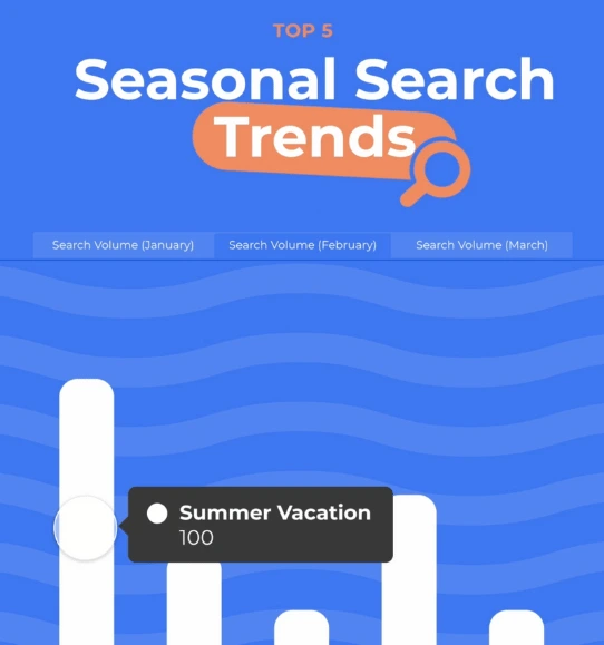
Engage Your Audience with Animated Charts
Animated charts are the perfect solution for crafting engaging and memorable data visualizations. Whether you're working with bar charts, line graphs, pie charts, or scatter plots, our tool makes it easy to customize your charts to meet your specific needs.
With Infogram, you can add dynamic effects, such as data point animations, hover effects, and scroll-activated animations to your charts. These effects not only make your charts more interactive but also visually appealing. Unlock the perfect blend of engagement and information with our captivating animated charts, tailor-made for businesses and organizations.

Add Life to Static Objects with Animations
Bring your static objects to life and make them more engaging and visually appealing to your audience with Infogram. Add dynamic effects such as zooming, bouncing, flipping, fading, and sliding to create interactive scenes that capture your audience's attention and keep them interested throughout your story.
For example, if you're telling a story about a character on a journey, you can animate a map or a compass to show their progress and direction. You can zoom in and out of different locations, highlighting important landmarks and events along the way. You can also add animations to the character's actions, such as a bounce or a flip when they reach a new destination or achieve a goal.
Object animations help you convey emotions and mood in your story. With a little creativity and basic animation skills, you can create engaging and compelling stories that captivate your audience from the beginning to the end.

Navigate Content Effortlessly with Page Linking
Make your content more user-friendly by adding page links. With just one click, your viewers can navigate the topics that interest them, creating an engaging and efficient reading experience.
If you have a long article or report with multiple sections, you can add links in the table of contents to direct viewers to specific segments. You can also add links within the text to provide more information on a particular topic or to reference outside sources. With page linking, you can make your content more organized and easier to navigate, increasing engagement and improving the overall user experience.

Enhance Visual Elements with Hover Tooltips
Elevate your visual designs by adding hover tooltips. Tooltips are small information boxes that appear when viewers hover over a specific area or element, making them ideal for providing additional context without cluttering your design.
Whether you're working with charts, images or maps, Infogram makes it easy to add tooltips to any element. For example, if you have a map displaying the population of different regions, you can add tooltips that appear when viewers hover over each region. These tooltips can provide additional information, such as the name of the region, the population density, or any other relevant statistics.

Personalize Data Exploration with Interactive Chart Legends
Chart legends are critical in providing context to your data. However, they can sometimes become overwhelming and cluttered, diverting viewers' attention from specific data points. With interactive chart legends, you can select and deselect portions of the chart legend to explore the data in a more personalized way.
For example, if you have a chart displaying sales data for multiple products, readers can choose which products to focus on rather than viewing all the products at once. It allows the reader to dive deeper into the data and gain more insights into specific areas of interest. Interactive chart legends not only enhance data exploration but they also create a more dynamic and engaging presentation.

Organize Data with Tabs
When presenting multiple charts, it can be challenging to keep your data organized and easy to understand. Infogram offers a solution with the ability to create tabs. By grouping related charts together under a specific tab, you can make it easier for viewers to navigate and explore your data.
For example, if you have two charts displaying the sales data for two different products, you can group them together under one tab labeled "Product Sales." This approach allows you to quickly access the information you need without being overwhelmed by too much data at once. Moreover, using tabs can help you create a more visually appealing presentation. By separating your charts into different tabs, you can create a more structured and organized layout that is both functional and aesthetically pleasing.

Enrich Your Content with Stickers and Gifs
Animated GIFs and stickers are fun and creative tools for enhancing your articles, reports, social media posts, and email marketing campaigns. They serve as powerful means to engage and entertain your audience, making your content more memorable and shareable.
For instance, suppose you have a report or infographic that displays your company's sales growth over the past year. In this case, you can create an animated GIF that shows the data changing over time, making it more dynamic and engaging. It helps your viewers to understand and interpret the data more easily, leading to better engagement and retention.

Maintain Brand Consistency
In today's competitive market, establishing a consistent brand image is critical for cultivating trust and recognition among your audience. However, when creating various types of interactive content, maintaining alignment with your brand guidelines can pose a challenge. That's where Infogram's brand kit comes in handy.
Infogram's brand kit is a powerful tool that enables you to create customizable templates that align with your brand's visual identity. You can easily upload your brand assets, such as logos, color schemes, and fonts, and apply them across your projects in Infogram. It ensures that all your interactive content, including charts, infographics, and maps, are consistent with your brand guidelines.

Embed Interactive Designs into Your Website
With Infogram, you can easily embed your interactive designs and projects directly into your website or blog. This invaluable feature enables your audience to fully engage with your content without ever leaving your site.
By embedding your Infogram content, you can create a more dynamic and engaging user experience for your website visitors. Users can actively engage with your charts, maps, and other visualizations, enabling them to gain a deeper understanding of your data and make more informed decisions.
So why settle for static charts and graphs when you can create interactive content that truly engages your audience? Try Infogram's embedding feature today and start boosting your engagement!


Customer Reviews
Here is what our customers have to say about us.
2022 Summer & Fall and 2023 Winter leader in Data Visualisation Software 4.7 out of 5 stars
See reviews on G2 ›Empowering 30,000+ Companies Worldwide
From startups to established enterprises, our platform has been embraced by a diverse range of businesses seeking to captivate audiences and simplify complex data. Here are just a few examples of the 30,000+ companies that use Infogram.


Learn More Practical Tips
Design
18 Surprising Data Visualizations in Your Everyday Life
Media
4 Tips for Telling an Effective Data Story
Marketing
7 ways to engage your audience during the holiday season
Design
7 key benefits of interactive data visualization
Marketing
How to increase social media engagement
Business
The guide to stakeholder engagement
Frequently Asked Questions
What is interactive content?
Interactive content refers to any type of digital content that encourages user engagement and participation. It's a way to involve your audience in your brand message or marketing campaign rather than simply presenting information to them in a static format.
Why is interactive content useful?
Interactive content is useful for several reasons:
- Increased Engagement: Interactive content is more engaging than traditional content because it allows users to participate actively and interact with the content. It can lead to higher levels of engagement, which can help to improve retention and increase the chances of users sharing the content with their friends and followers.
- Personalization: Interactive content can be personalized to the user's interests or needs, making it more relevant and useful.
- Brand Awereness: Interactive content can help to increase brand awareness by providing a unique and memorable experience that users are likely to share with their friends and followers. This can help to increase your reach and build brand loyalty.
- Improved User Experience: Interactive content can help to improve the user experience by providing a more enjoyable and informative experience that meets their needs and interests.
What are the most popular types of interactive content?
Popular types of interactive content include interactive infographics, interactive maps, quizzes, calculators and tools, image sliders, games, and interactive webinars.
- Interactive infographics allow users to explore data in a more personalized way. Also, they can provide a more dynamic and flexible way of presenting information, increasing the potential for sharing and virality.
- Interactive maps provide a visually compelling way to display information related to location, geography, or demographics, and can be used to tell a story or guide users through a particular journey. Also, they’re great for driving desired actions.
- Quizzes are enjoyable and often shared among friends, making them a perfect way to challenge others and show off one's results.
- Calculators and online tools can help to boost engagement, generate leads, and build links from the press through digital PR efforts.
- Image sliders allow you to showcase multiple images or pieces of content within a small space and create a more dynamic and visually engaging experience.
- Games are inherently fun and engaging, providing an immersive and interactive experience that captures users' attention and keeps them entertained for longer periods of time. They’re also great for educating users or helping them learn a new skill.
- Interactive webinars allow you to engage with your audience in real-time, provide valuable and educational content, and collect feedback and insights from your audience.
How do you create interactive content in Infogram?
- Open your library.
- Choose a project you want to create (infographics, reports, slides etc.)
- If you want some inspiration, choose one of many Infogram templates or select a blank template to start from scratch.
- After you’ve chosen your project type and template, start editing your project (you can add charts, maps, and other elements that better suit your project).
Didn't find the answer? Check our FAQs

Try Infogram Now!
Are you ready to unleash the power of data visualization? Get started with Infogram today and create stunning, interactive content that captivates your audience. Elevate your projects and bring data to life.