
Create Infographics That Tell Powerful Stories
Build interactive infographics that simplify complex data and draw in your audience - no advanced skills required.


4.7 out of 5 stars


Overview
Why
Types
Examples
Reviews
Tips
FAQ
Craft Infographics That Resonate
As a data journalist, investigative reporter, social media manager, content marketing manager, event manager, or advocacy specialist, you need infographics that make data accessible and compelling. Infogram lets you create visuals that turn numbers into narratives, whether you're exposing trends in a report or rallying support for a cause.
Data journalists can design clickable infographics to unpack news stories. Investigative reporters can map evidence for in-depth pieces. Social media managers can create animated infographics for shareable posts. Content marketing managers can build data-driven infographics for blogs, event managers can visualize participant stats for recaps, and advocacy specialists can craft infographics to highlight issues and drive action.
Pull in data from spreadsheets or PDFs, and use AI to suggest layouts that fit your story. Add interactive elements like hover details or animations to keep viewers engaged. Infogram handles the details, so you can focus on delivering insights that inform and inspire.
Why Pros Choose Infogram for Infographics
Practical ways Infogram helps you build infographics that engage and inform.
Draw In Audiences with Interactivity
Create infographics with clickable sections or animated elements to hold attention. A data journalist can add interactive layers to a news infographic, while a social media manager can animate stats for a viral share.
Infogram's 35+ chart types and 800+ maps make data pop, and content engagement analytics help you see what works best.
Break Down Complex Data
Turn tangled datasets into straightforward infographics. An investigative reporter can map connections in a scandal infographic, while an advocacy specialist can chart policy impacts.
AI suggests the right charts, and data imports from various sources speed up the process. Custom tooltips provide on-hover clarity, making your points easy to grasp.
Align with Your Brand or Cause
Customize infographics to fit your style using Infogram’s brand kit for logos, colors, and fonts. A content marketing manager can ensure blog infographics match the site's look, while an advocacy specialist can adapt visuals to a campaign's theme.
Tools like color picking and image masking add a professional touch without extra effort.
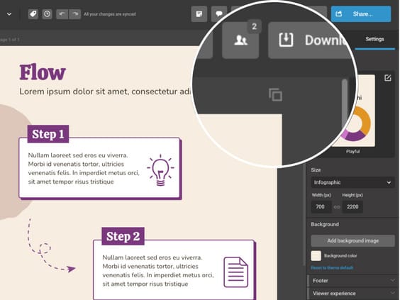
Work Together on Infographics
Real-time collaboration keeps your team in sync for timely infographics. An event manager can share drafts with colleagues for feedback on an event recap infographic, while a data journalist collaborates with an editor.
Team templates ensure consistency, saving time in fast-paced environments.
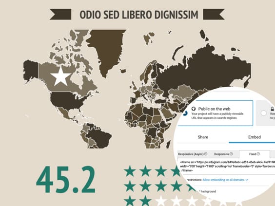
Share Infographics Effortlessly
Embed infographics in articles, sites, or slides with no coding needed. Auto-updating designs keep your work current, useful for an advocacy specialist sharing petition progress or a social media manager posting event highlights.
Export as MP4 or GIF for quick social shares, reaching audiences where they are.

Speed Up Creation with AI
Infogram’s AI takes care of routine steps, freeing you for the story. It generates layouts from your data or topic, converts images to charts, or adjusts for different languages.
A content marketing manager can whip up a blog infographic in minutes, while an event manager creates sponsor visuals quickly.
Infographic Types to Explore
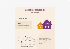
Statistical Infographics
Showcase your data clearly with charts like bar graphs, line charts, pie charts, and scatter plots.
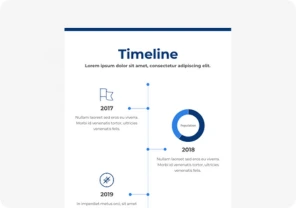
Timeline Infographics
Visualize the flow of time by displaying key events, dates, and their descriptions in an easy-to-follow layout.
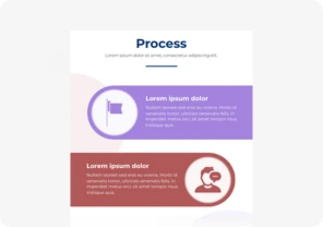
Process Infographics
Break down processes into clear steps with a mix of images and text to make complex procedures easy to understand.
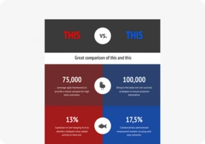
Comparison Infographics
Compare different items or options with side-by-side visuals, charts, and tables to help make decisions easier.
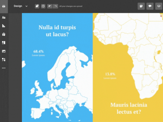
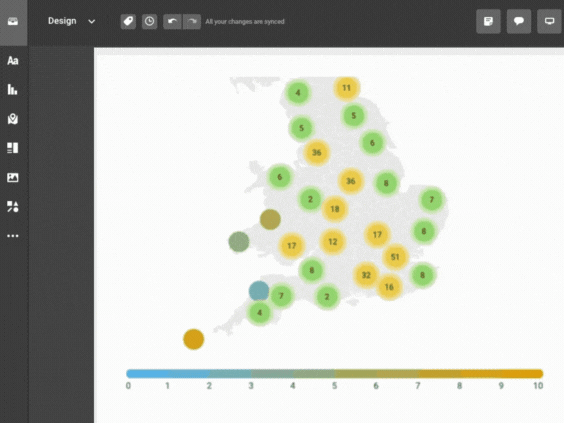
Geographical or Map Infographics
Use maps to show data by region, with color codes and icons to illustrate trends and distributions.
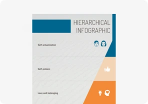
Hierarchical Infographics
Display the structure of a system or organization with diagrams that show different levels and their relationships.
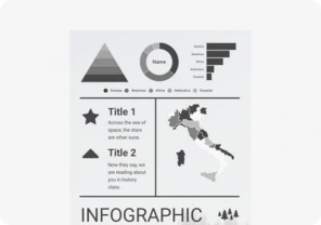
Infographic Reports
Combine text with charts, graphs, and illustrations to provide a detailed summary or research report.
Interactive Infographics
Engage users with interactive features like animations and clickable elements that allow them to explore content in depth.


Customer Reviews
Here is what our customers have to say about us.
2022 Summer & Fall and 2023 Winter leader in Data Visualisation Software 4.7 out of 5 stars
See reviews on G2 ›Empowering 30,000+ Companies Worldwide
From startups to established enterprises, our platform has been embraced by a diverse range of businesses seeking to captivate audiences and simplify complex data. Here are just a few examples of the 30,000+ companies that use Infogram.


Learn More Practical Tips
Marketing
Brand storytelling: 4 brand story examples to inspire you
Design
18 Surprising Data Visualizations in Your Everyday Life
Media
4 Tips for Telling an Effective Data Story
Marketing
5 tips on writing online articles that people actually want to read
Marketing
3 Unique Ways to Optimize Your Landing Pages with Charts
Marketing
7 ways to engage your audience during the holiday season
Frequently Asked Questions
How does Infogram make infographics easy to create?
Infogram’s 35+ chart types, 800+ maps, and AI-driven tools turn data into interactive infographics fast. For example, a data journalist can build a clickable timeline for a news story, while a content marketing manager can create a blog infographic, all without design expertise.
Why are interactive infographics effective for engaging audiences?
Interactive elements like clickable charts or animated maps draw audiences in, encouraging exploration and sharing. They make complex data memorable, boosting retention for news stories, campaigns, or social posts by letting viewers dive into the details.
How do I create an interactive infographic with Infogram?
Start with a template or blank canvas, add charts, maps, or animations, and customize with your data and branding. AI suggests the best layouts, while features like custom tooltips or zooms add interactivity, making your visuals engaging and professional.
Can Infogram help simplify complex data for my audience?
Yes, Infogram turns dense datasets into clear visuals. An investigative reporter can map crime trends, while an advocacy specialist can chart policy impacts. Features like data imports and AI chart suggestions make it easy to present insights clearly.
How does Infogram support team collaboration on infographics?
Real-time collaboration lets teams edit visuals, share templates, and provide feedback instantly. A social media manager can work with an event manager to align campaign visuals, ensuring consistency and saving time, even across remote teams.
What’s the easiest way to share infographics with Infogram?
Embed infographics in websites or articles with no coding. Auto-updating, responsive designs keep your visuals current, perfect for a data journalist sharing live election results or an event manager updating sponsor reports.
How can content engagement analytics improve my infographics?
Analytics track clicks, views, and shares, showing what resonates. A social media manager can optimize posts for better engagement, while an advocacy specialist can refine campaign visuals to drive more support, using data-driven insights.
How does Infogram ensure my infographics align with my brand?
Infogram’s brand kit applies your logos, colors, and fonts across visuals. Features like color picking and image masking ensure a cohesive look, whether for a content marketing manager’s blog graphics or an advocacy specialist’s campaign materials.
Can Infogram save time when creating infographics?
Yes, AI tools suggest chart types, convert images to data, and adjust content, while features like PDF import and content auto-align streamline design. This lets a social media manager or event manager create polished visuals in minutes.
How does Infogram make infographics accessible to all audiences?
Infogram’s visuals are screen-reader friendly, ensuring inclusivity. This helps data journalists reach broader readers and advocacy specialists meet accessibility standards, making campaigns or reports more impactful.
Didn't find the answer? Check our FAQs

Try Infogram Now!
Are you ready to unleash the power of data visualization? Get started with Infogram today and create stunning, interactive content that captivates your audience. Elevate your projects and bring data to life.